|
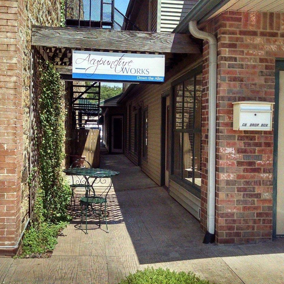
I created this logo for a client and today I got to see it in action! I love seeing the logos out in the wild!
0 Comments
Our newspaper needed a new logo. The one we were using was outdated, tired, not user friendly, wasn't done correctly, combined a hi-res tiff (for the middle graphic) and then shadowed text for the words. Plus it wasn't outlined at all, so depending on who was using it determined if the font was going to break or not.
The below is what I created. Clean, simple, all vector, user friendly, and can easily be made into grayscale. |
Categories
All
|

|
|


 RSS Feed